Hello and welcome to My Work.
As a graphic designer and Art Director, My Work is a blend of creative passion and purposeful execution. I'm dedicated to crafting visuals that are not only compelling but also a true reflection of the client's identity.
Dive in to explore projects where innovation and brand integrity go hand in hand.

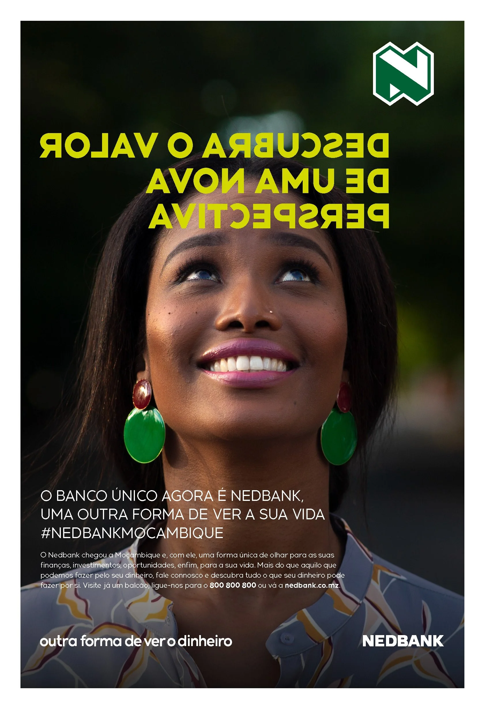
Discover the value of a new perspective
NEDBANK Launching campaign in Mozambique. The headlines in the press appear inverted -they are from the perspective of the person inside the ad.
Client
NEDBANK Mozambique
Year
2021
This summer nothing will pass you by
Each video represents a summer reference in the life of every Portuguese.
Client
NOS
Year
2014
The Price is Right scratch lottery
A couple is dining, and the man tries to propose to the woman with a ring, to which she starts trying to guess the ring value with the help of the other people in the restaurant.
Client
Jogos Santa Casa
Year
2012
Eveyone has a favorite number, and now, you can choose yours
Lottery campaign: for the first time, you can choose the numbers in the Portuguese lottery.
Client
Jogos Santa Casa
Year
2013
Vodacom Starter Pack
With the Vodacom Starter Pack, everything is always gonna be alright.
Client
Vodacom Mozambique
Year
2013


Logos as needed
I do casual work, such as the development of logos, graphics, banners and other publishing materials.
For learning materials, I also film and edit.
Client
Faculty of Pharmacy and Pharmaceutical Sciences, Monash University
Year
2017 - 2025
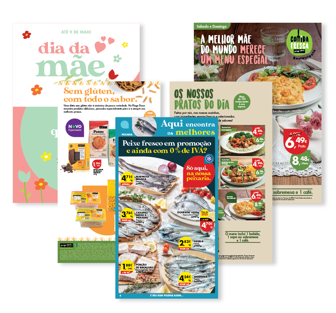
Sweet Drop (Pingo Doce)
I´ve done the Art Direction for multiple projects for the Portuguese retailer Pingo Doce. These are a small sample.
Client
Pingo Doce
Year
2021 - 2023


PharmAlliane partnership
PharmAlliance is the partnership between Monash, UNC and UCL (3 pharmacy schools). The logo was created to represent the link between the schools.
The website was developed in WordPress.
Client
Faculty of Pharmacy and Pharmaceutical Sciences, Monash University
Year
2020
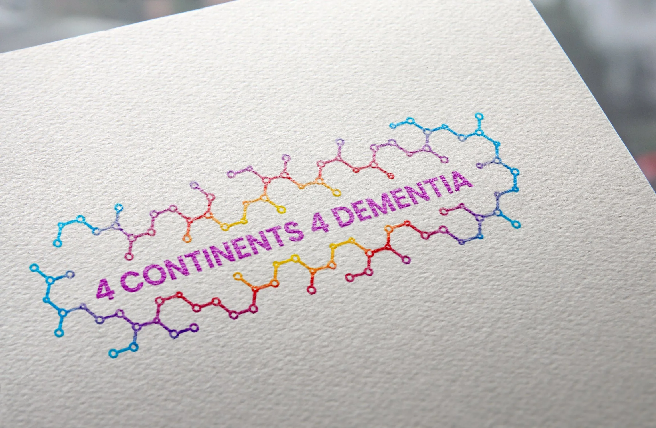


Four continents for dementia
The logo combines the bright colours of a brain scan, representing neurological conditions, with detailed chemical structures symbolising medicine. This blend shows the link between science and healthcare, making the design both eye-catching and meaningful.
Client
Faculty of Pharmacy and Pharmaceutical Sciences, Monash University
Year
2020
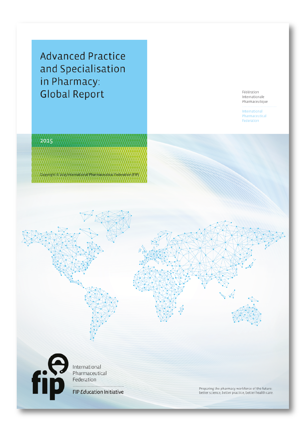

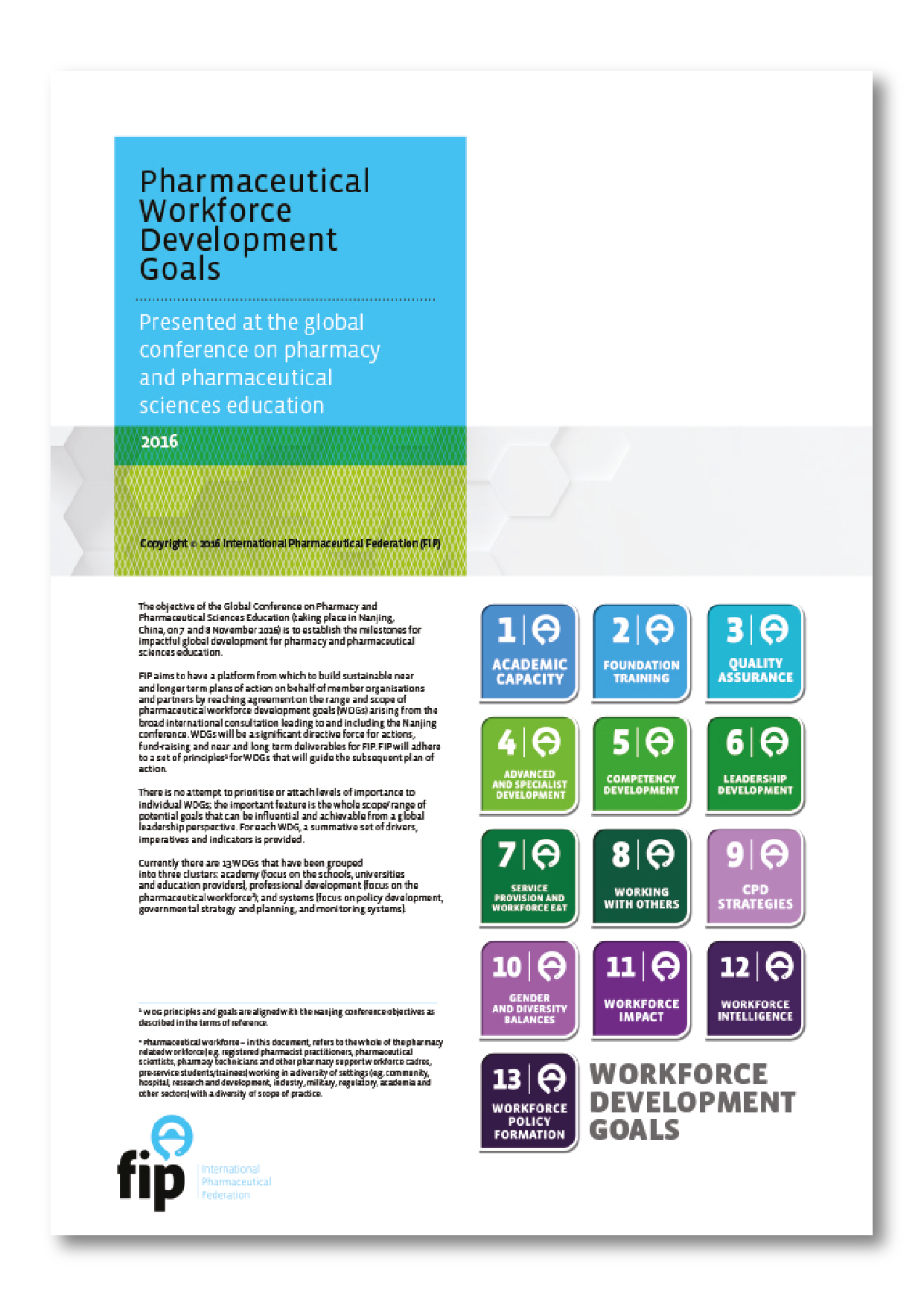

Annual Education Reports
From 2015 to 2017, I was responsible for the concept, design, graphics and final art of the annual FIP Education global reports and other publishing materials.
Client
International Pharmaceutical Federation (FIP)
Year
2015 - 2017
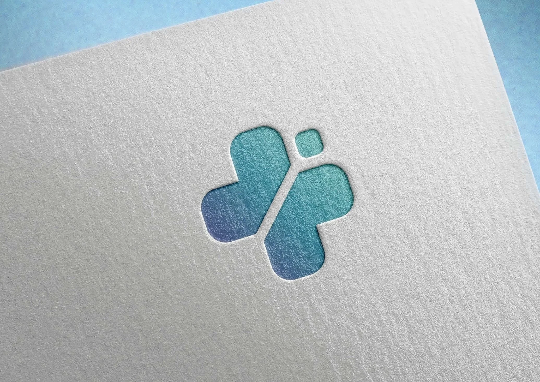

Taking care of the one's who take care of themselves
CTA is a clinic specialising in nutrition, physiotherapy, and aesthetics. Their core brand values are nurture and well-being. The logo was created as a combination of a cross (health) and a butterfly (nature).
Client
CTA (Talatona Clinic of Angola)
Year
2016
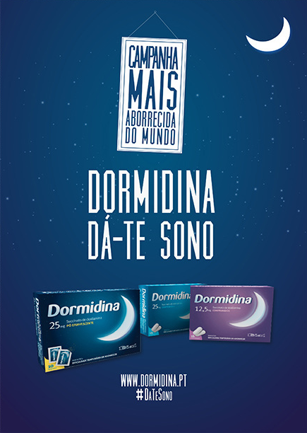
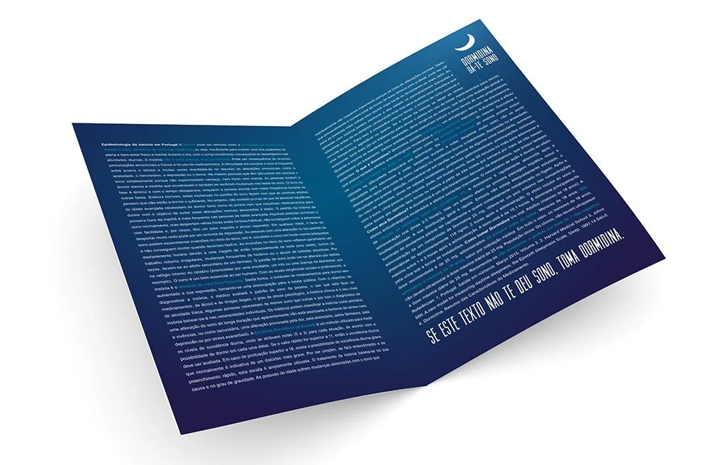
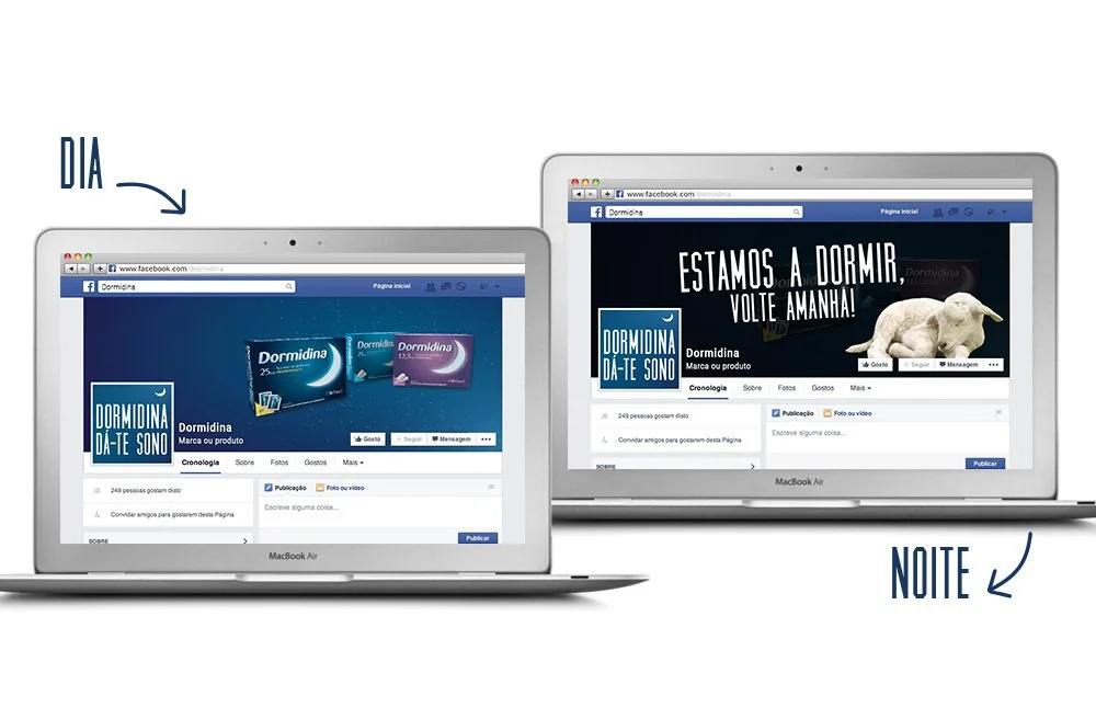
Dormidina makes you sleepy
All media materials were designed to be boring. The brochure had a very boring text and at the end had the following sentence - “If the text does not make you sleepy, take Dormidina”. The Facebook page, after 10:30 pm, only had the banner visible with the sentence - “We are sleeping, come back tomorrow!”
Client
Dormidina
Year
2015